If you are anything like me, you have used and loved the original bootstrap CSS grid system for quite a few years. The original version predated flexbox having broad support and used floats instead.
The 12 column grid design is hard to fault.
A couple of years ago I decided to try and recreate the same 12 column grid using CSS Grid. If you are unfamiliar with CSS Grid - this is the feature introduced back in 2011.
You can read more about the Story of CSS Grid here…
In a nutshell, CSS Grid solves a lot of the problems with creating a cohesive responsive grid system in CSS.
Today I am going to outline how I used CSS Grid to create a simple 12 column responsive Grid. I’m using SCSS to reduce the amount of repetition.
It all starts with ‘display: grid’
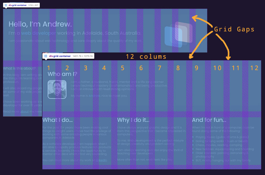
We define where the grid starts with a simple class called ‘grid-container’. This is using scss variables.
The container is declared as following:
$num-cols: 12 !default;

.grid-container {
    display: grid;
    grid-template-columns: repeat($num-cols, 1fr);
    grid-gap: 0.5em;
}The grid container is using some new CSS keywords. (Note the strange looking 1fr unit.)
grid-template-columns: repeat($num-cols, 1fr); The 'repeat' saves having to repeat '1fr' 12 times. So, what does this give us? 12 columns evenly spaced with a 0.5em gap between. The gap is not repeated at the very start or end.
This blog is using the same grid system. If you open up the chrome dev tools you should be able to see the grid highlighted on the home and about pages.
Populating the Grid
Let’s add two items split evenly into the grid. The class grid-xs-6 tells the div to spread out across 6 of the grid’s columns. Because there are 12 columns the div’s are evenly spread.
The ’xs’ means that the class should apply for extra-small devices and up.
<div class="grid-container">
    <div class="grid-xs-6">first half</div>
    <div class="grid-xs-6">second half</div>
</div>
The responsive design aspect is driven by the following SCSS snippet
$i: 1;

@while $i <= $num-cols {
    .grid-xs-#{$i} {
        grid-column: span $i;
    }

    $i: $i + 1;
}
This is translated to the following CSS:
.grid-xs-1 {
    grid-column: span 1;
}

.grid-xs-2 {
    grid-column: span 2;
}

...

.grid-xs-12 {
    grid-column: span 12;
}
Responsive Layouts
Cool, this is working well. Now to add some ’responsive design’ to the grid.
We use simple media queries to create the next tier. ’sm’ These are devices which are larger in width than a mobile phone. Typically a Tablet device or the phone running in landscape mode (sideways).
In my variables - I have defined the boundary to be starting at 600 pixels.
The class grid-sm-6 tells the div to spread out across 6 of the grid’s columns. BUT only when the device’s width is greater than a 600px wide. i.e. Tablet or Desktop.
The first div is specified to always be 12 columns wide.
<div class="grid-container">
    <div class="grid-xs-12">always full width</div>
    <div class="grid-xs-12 grid-sm-6">split 50/50 on tablet + desktop</div>
    <div class="grid-xs-12 grid-sm-6">split 50/50 on tablet + desktop</div>
</div>
The responsive design aspect is driven by the following SCSS snippet
$small-screen-up: 601px !default;
$small-and-up: "only screen and (min-width : #{$small-screen-up})" !default;
$i: 1;

@media #{$small-and-up} {
    @while $i <= $num-cols {
        .grid-sm-#{$i} {
            grid-column: span $i;
        }

        $i: $i + 1
    }
}
This is translated to the following CSS:
.grid-sm-1 {
    grid-column: span 1;
}

.grid-sm-2 {
    grid-column: span 2;
}

...

.grid-sm-12 {
    grid-column: span 12;
}
Awesome, now show me the code!
I have put the SCSS classes into github.
Feel free to take this and make it your own!
Hope it helps you understand how we can take advantage of the new-ish CSS grid in creating easy to maintain grid layouts.